Do you want to understand why the atoms that make up the universe, act the way they are around each other and not jumble up into a pile and collapse into a black hole? Do you want to understand how people make choices in how they spend their money? When asking these questions, the answers might come in the form of mathematical functions that rarely instantly provide us with the intuition that we seek. The method of extracting understanding from mathematical functions is what we call graph sketching.
This post will briefly cover some basic concepts on graph sketching that you may feel free to skip forward if you are already acquainted with, and then move on to some more advanced concepts that might expand your graph sketching toolkit.
Functions 🖨️

Functions are machines that take inputs, changes them based on a set of instructions (its mathematical expression), and spits out an output. The range of inputs that a function takes in is called the domain while the range of outputs possible for the machine is called the codomain. Graphs are a way to visualize this process. Where, depending on the convention used, the \(x\)-values represent the inputs and the \(y\)-values represents the outputs, ultimately giving you a curve.
Important Points ⚠️
Not all points are created equal. Some characterize a graph very strongly, leaving behind much desired information about the process the graph is describing. One example of such points are intercepts. Intercepts can be found where the curve meets the axes and they signal the value of the input or the output when the other is zero.
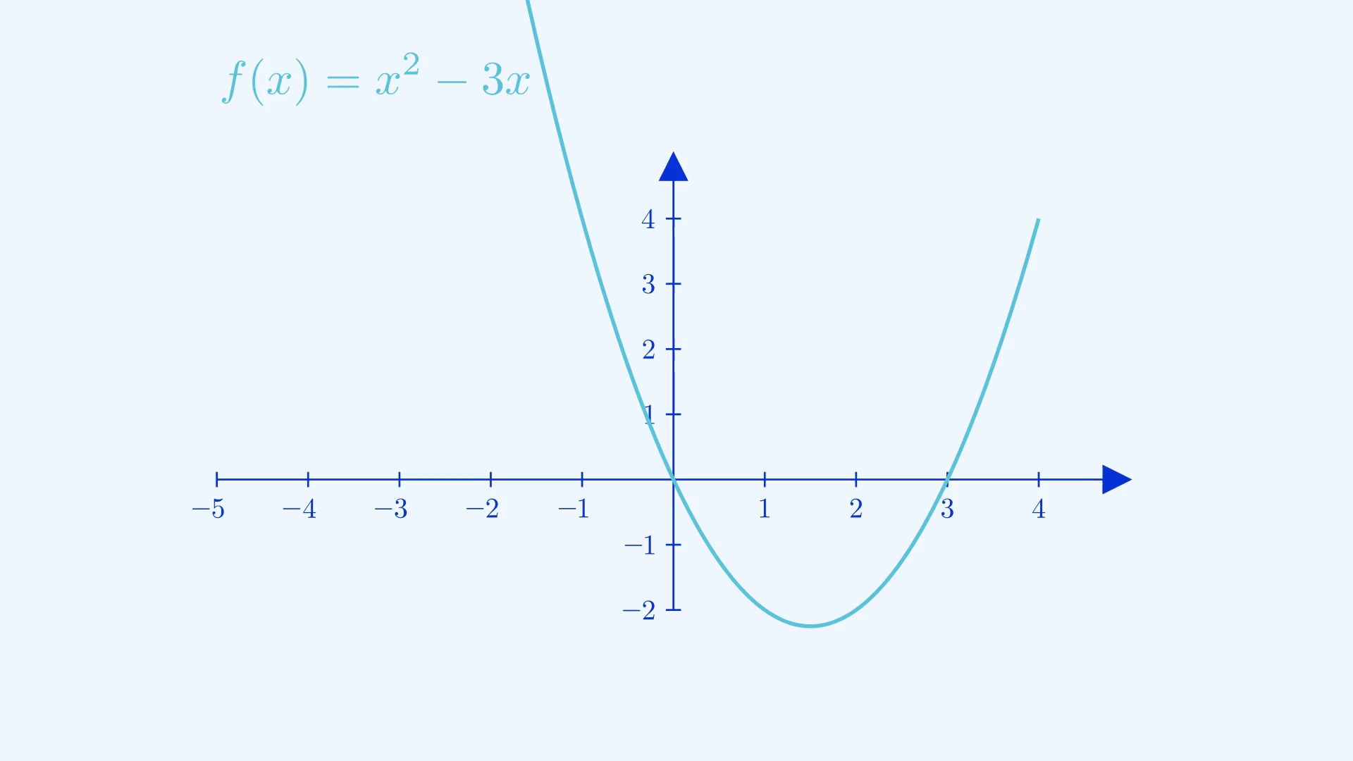
Another great example would be local maximum and minimum points or turning points. They can be found when the derivative of the function (how much the output increases in value when the input increases in value) is zero. To differentiate between maximum and minimum points, the second derivative (how much the derivative increases in value when the input increases in value) is computed, and it’s a maximum point when the second derivative is less than zero and vice versa. These points are called local maxima and minima because there can be points that exceed the maxima or fall behind the minima when looking at the graph as a whole.
Transformations 📅
Often the situations we’re trying to model with our graphs change, we have to then transform our original graphs to accommodate these changes. Here are a few examples of transformations.
Translation

The way to think about this transition is we’re taking the output that is \(a\) units to the right of the original output(looking from the graph), which would shift the graph \(a\) units to the left. That’s why you see the slider for \(a\) and the graph moving in opposite directions.
Stretching

Similarly, you would take the output of the input \(ax\) and bring it to replace the input \(x\) for each point, this would create a “squishing” effect towards the \(y\)-axis when \(|a|>1\) and vice versa for the other case.
Reciprocal
When you find the reciprocal of the entire function, it’s important to notice how values change depending on what they initially were. The closer to zero a fraction was, the larger it ended up being and vice versa for values of \(|f(x)|\) greater than \(1\). Points that had outputs of magnitude \(1\) stayed stationary, the \(x\)-intercepts commit the grave sin of division by zero and were cursed to be undefined, shown as asymptotes(explained later in the post) in the resulting graph. You can apply the same logic to perform the transformation of \(f(\frac{1}{x})\) , the difference is that you’ll be swapping the treatments of inputs and outputs in this case.
Identifying Trends 🔍

Just like how Google commemorates the most trending searches every year in a video, it is paramount for us to identify the trends in graphs. Be it identifying regions where the graph is increasing(when the derivative is positive) and vice versa, or looking for when the graph repeats a certain pattern over and over again(periodicity) just like Ragnarok. Periodicity can be proven when every two points separated by a constant called the period \(T\), has the same output value. This can be mathematically expressed as \(x(t) = x(t + T)\). All trigonometric functions boast this property.
Asymptotes are “finishing lines” that graphs inch closer and closer towards and yet never seem to reach. They are usually found by taking the limit of \(x\) tending to infinity or negative infinity. Limits are also used to find the behaviours of graphs as they are close to undefined points(e.g. points where division by zero occurs).
Sometimes, the direct evaluation of a limit gives you a “sickly number” like \(\frac{0}{0}\) or \(\frac{\infty}{\infty}\). These numbers are called indeterminate forms. But fear not, if hospitals are the go-to destination for the sick, L’Hopital’s rule is the next stop for indeterminate forms. It tells us that we can differentiate the numerator and denominator before taking the limit for indeterminate forms. This greatly helps the evaluation of limits such as \(\lim_{x \to \infty}\frac{e^x}{x^2}\).

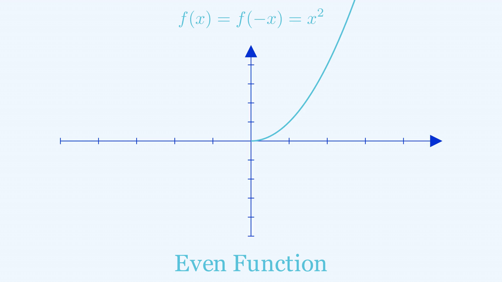
Mirrors aren’t only useful for mirror selfies, “mirrors” can also help in giving you crucial information when sketching a graph, in particular graphs of even and odd functions. An even function is a function that gives the same output when you give in the negative of an input, or in other words \(f(-x) = f(x)\). You can find the shape of such a graph to the left of the y-axis by treating the \(y\)-axis like a mirror and reflecting what’s on the right side.
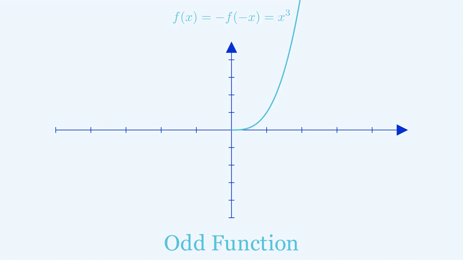
An odd function gives the negative of the output when you give in the negative of an input, in other words \(f(-x) = -f(x)\). The right-hand side of such a graph can be found by doing two reflections on the shape of the graph where \(x>0\), the first of which is the same as what we did for even functions. The second step is to treat the negative \(x\)-axis as a mirror and reflect again.
Decomposing and Composing a Graph 🧱

A complicated graph oftentimes is like a complex Lego construction, built upon simple building blocks which are fundamental functions such as \(e^x\) and \(\sin x\). I’d recommend you find yourself familiar with these fundamental functions and the trends they represent as they come up a lot as general trends in real life. When someone tells you that something is exponentially increasing, having the idea of the exponential graph in the back of your mind can do wonders in providing intuition during problem-solving and analyzing information. When asked to sketch complicated graphs it is important to break them down into their individual pieces and discern some features from them.
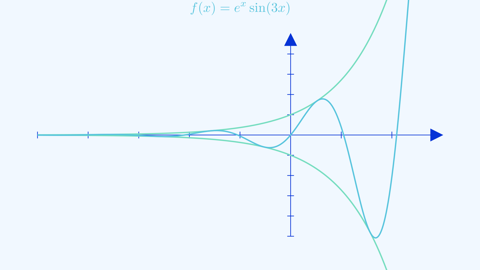
Let’s say that a function you are trying to sketch is a product of two functions known to you, you can easily figure out the regions where the graph is positive(the regions where both graphs have the same sign) and negative(the regions where both graphs have opposite signs). You can even surmise that the regions where the values of either constituent graph are zero will result in a zero in the final graph. When one of those constituent graphs only has output magnitudes that never exceeds \(1\), then the resulting graph will always be confined by the other constituent graph since the resulting graph will always be a fraction of it. An example of this can be seen in the function \(f(x) = e^x\sin (x)\). Exploring different combinations of functions and their effects on the resulting graph will be good practice for your logical skills.
Time to Sketch the Talk ✏️

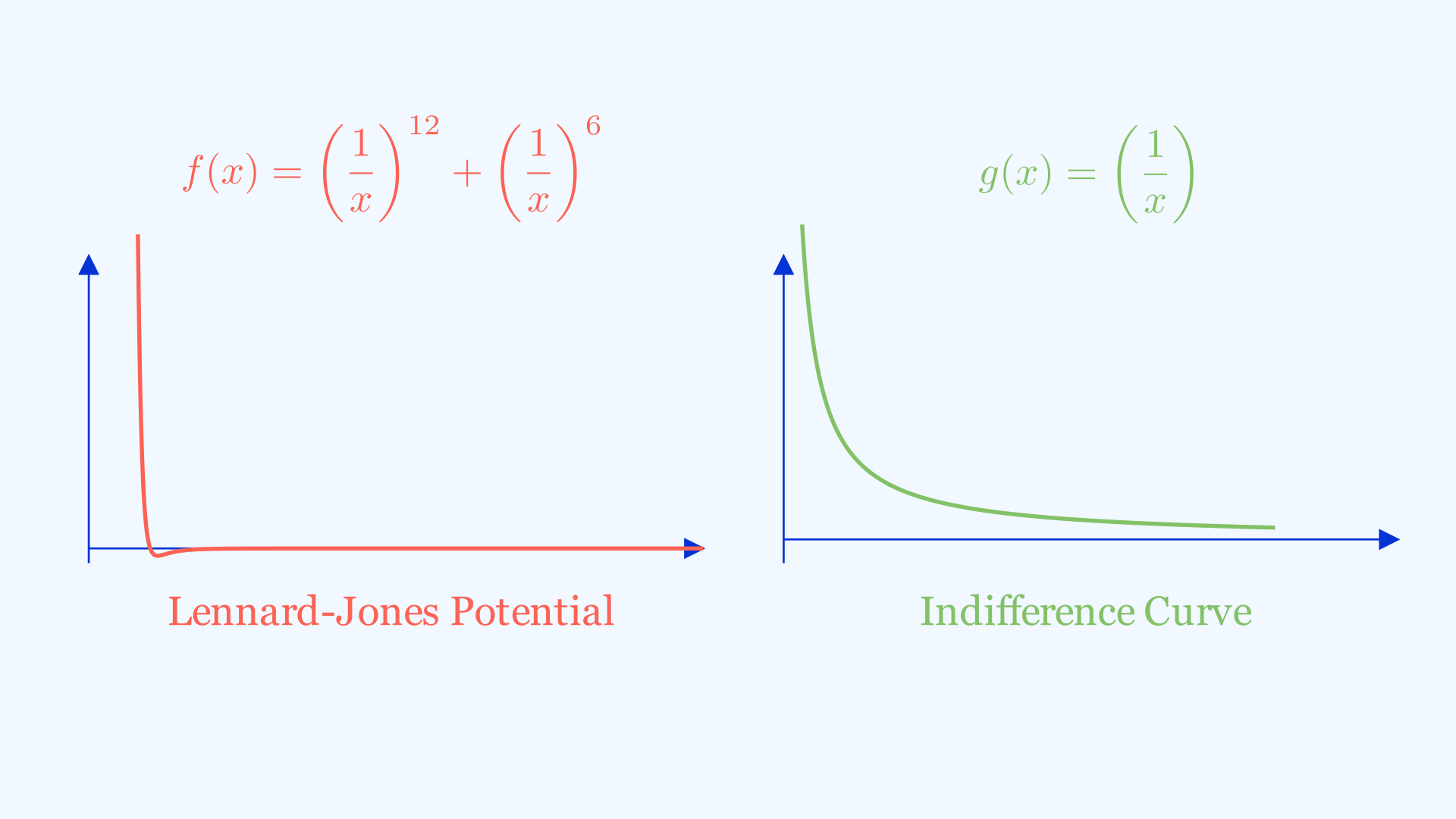
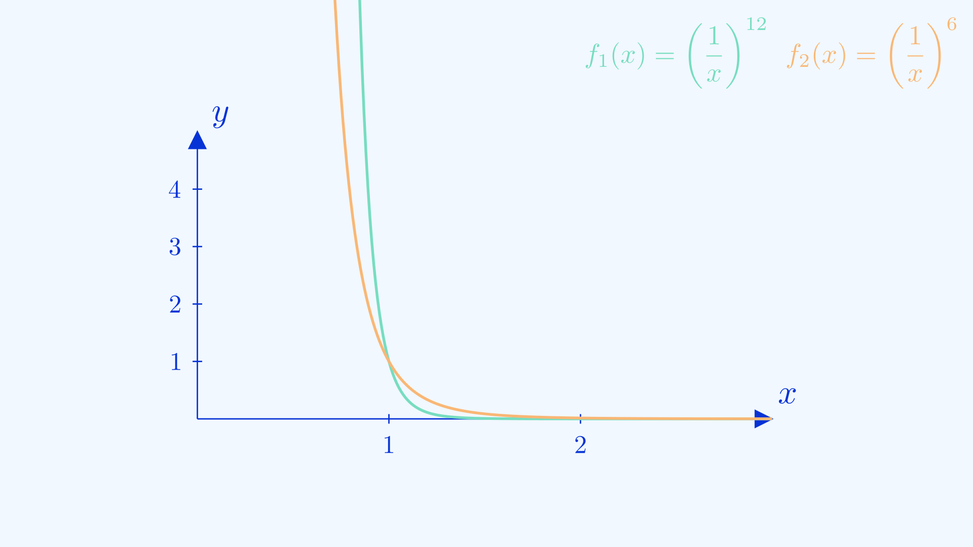
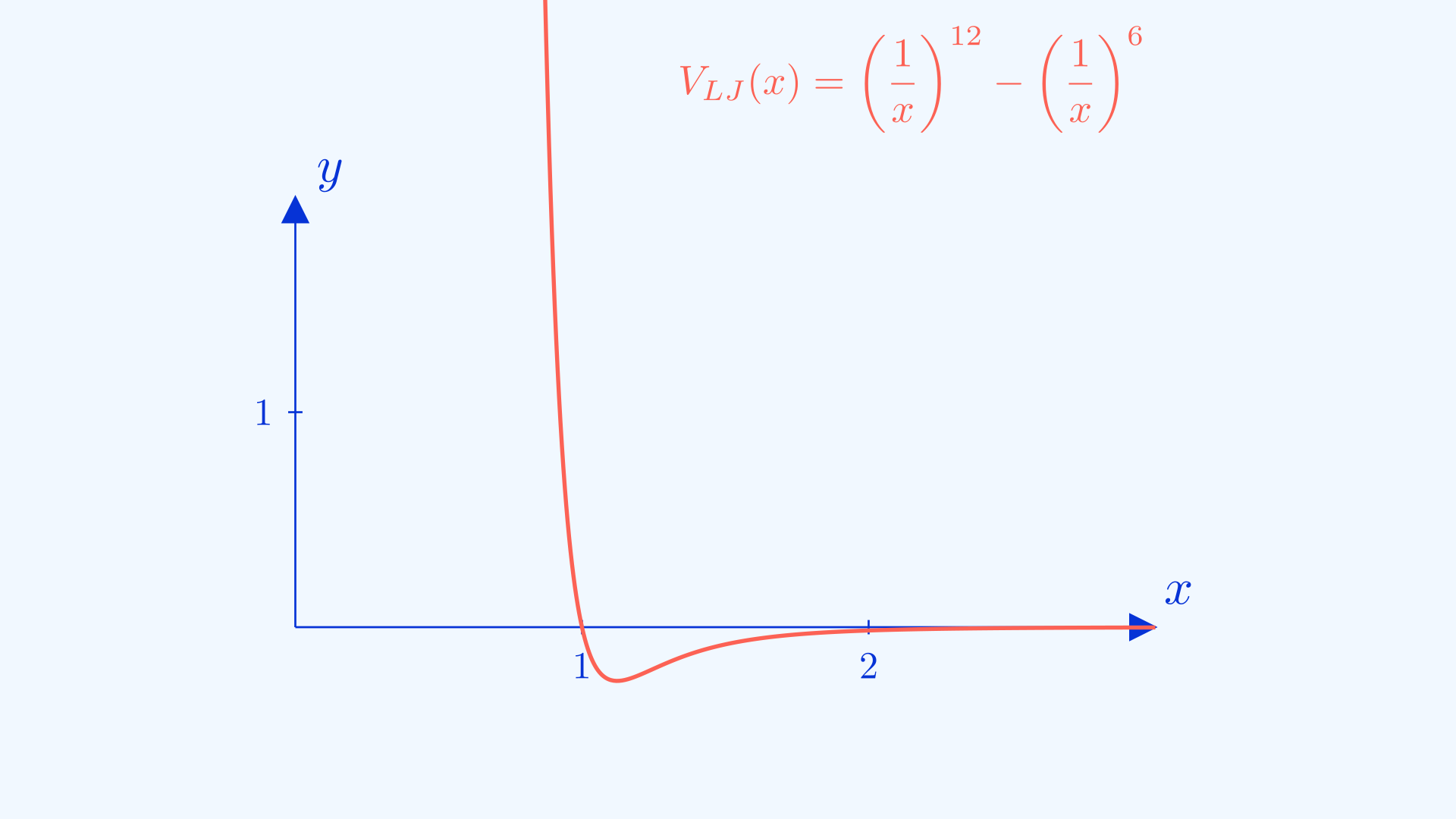
Remember at the start of the article I promised that learning the art of graph sketching would give you some insight into the behaviours of particles? Here we’re going to attempt to do just that and sketch the graph showing the Lennard-Jones potential \(V_{LJ}(\frac{r}{\sigma}) = 4\epsilon[(\frac{\sigma}{r})^{12} - (\frac{\sigma}{r})^{6}]\) . Don’t let the symbols scare you, if we take all the constants away and use x as the input, we will still retain the shape of the graph and we will be able to sketch it, which leads us to a much simpler form of \(V_{LJ}(x) = (\frac{1}{x})^{12} - (\frac{1}{x})^{6}\). The domain for this function is \(x>0\).
Firstly, we notice that the resulting function is the difference of two more elementary functions which we will label \(f_1(x) = (\frac{1}{x})^{12}\) and \(f_2(x) = (\frac{1}{x})^6\). Let’s sketch these two graphs first to get a feel for the properties of the resulting graph. We know that both of them will have shapes resembling \(\frac{1}{x}\), and for \(\frac{1}{x}\) values below \(1\), \(f_1(x) < f_2(x)\) and vice versa. You can prove this to yourself by understanding that multiplying by a fraction is essentially taking a “fraction”(no pun intended) of what you initially had. And \(f_1(x)\) is essentially doing that \(12\) times, which yields a smaller number than \(f_2(x)\). The opposite case is true for \(f(x) >1\) while the graphs should intersect at \(x=1\). Using that knowledge we can sketch both of them on the same axis as follows.
From this we can actually ascertain the regions where the graph is positive (when \(f_1(x) > f_2(x)\)), negative (when \(f_1(x) < f_2(x)\) ) and its x-intercept (\(f_1(x) = f_2(x)\)) . The minimum point will be the point when \(f_1(x)\) is highest over \(f_2(x)\), (you can also find this point using differentiation). And voila, you have your final graph.
Extracting Insight 👁️
Now we try to interpret what the graph actually means. Let’s provide some context. Put simply, the input for the graph is the distance a particle is from another one that is fixed in position. The output is the potential of the particle. We can think of this potential like how we treat gravitational potential, the higher we are, the more potential we have and the more energy we have as we go “downhill”. That’s why we tend to move towards lower potential and achieve stability. This is the same and from the graph, we observe a minimum point where the particle is stable. Any closer towards the fixed particle we get repelled, any further we get attracted back to the same position. And since particles need to keep a safe distance from one another. This gives us insight into intermolecular forces and how matter occupies space, where they don’t all attract each other so much they collapse into a black hole, nor do they repel each other so much that they are super far away from each other.
Conclusion ✨
There is no one-size-fits-all way to sketch graphs. Some graphs, as with most mathematics, require some ingenuity in finding their solutions. This post merely scratches the surface of this complex topic but provides a good starting point for curious souls like you to venture further. I hope that with this newfound knowledge, you may challenge harder graph sketches or apply them to a variety of practical situations and problems. Don’t forget to subscribe for more cool content that inspires you to learn more about this wonderful world around us.